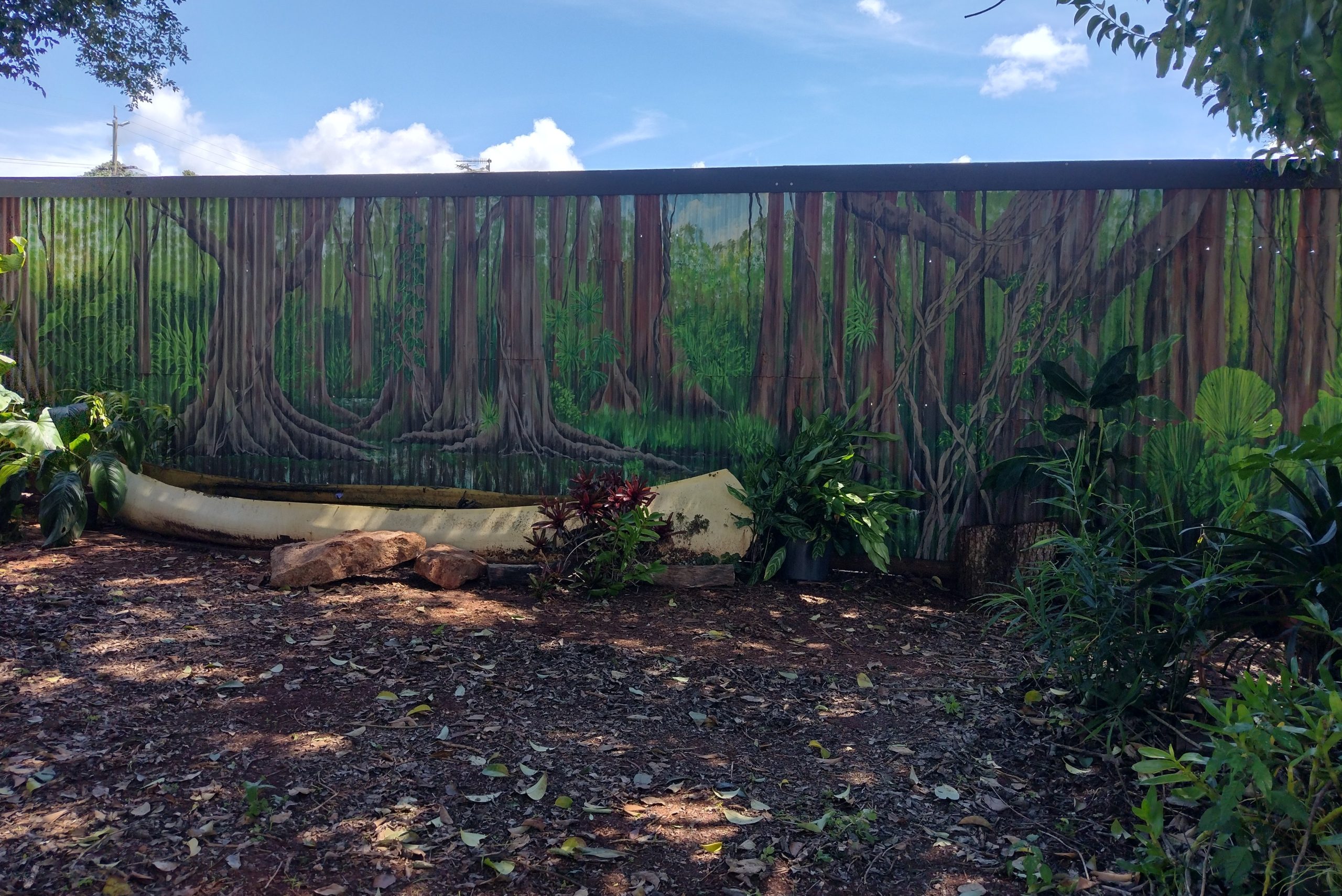
The brief sounded reasonable enough: Pete, who approached me via a volunteering portal, was seeking someone to paint a fence in his garden. It was rather a large fence, long and relatively low, which he’d erected when his neighbour had chopped down some trees, eliminating at once his privacy, shade and aesthetics. Somehow, these things had to be replicated. A forest, realistic enough to step into, would do the trick.
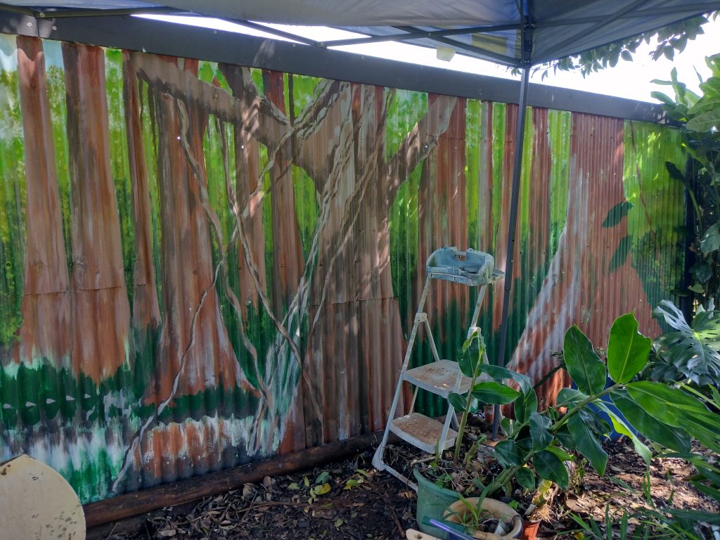
Never being one to shirk a challenge, and keen on the arrangement which offered a free room, sustenance and outings – including kayaking trips to beautiful crater lakes – I accepted with genuine enthusiasm but semi-feigned confidence, after being shown examples of rainforest murals as ‘inspiration’. Before I had got as far as visiting the site and realising that the surface of the ‘fence’ was deeply corrugated; the severity of this handicap becoming fully evident with the first brush stroke, but not before.
‘Limited palette’ takes on a whole new meaning when using outdoor, weatherproof, semi-sheen colours which don’t necessarily mix in a way you’d expect, nor do they dry the colour they appear on the chart. I insisted on a bright yellow; a blue, and a dark, forest green be added to the collection of vivid test-pots accrued over the years, lurking on dusty shelves in the shed. I was supplied with a variety of used decorators’ brushes, rags and a trestle table upon which I lined up all the colours and empty yoghurt pots for mixing. In view of the forecast, Pete erected a nifty, though flimsy, waterproof gazebo for the occasional torrential downpour, which eventually contorted itself into a broken, sodden mangle across my table during an overnight storm.
I had a week: I needed to get used to some uncharacteristically early starts.
Stage 1
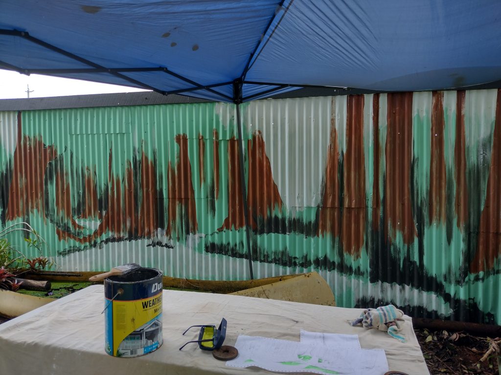
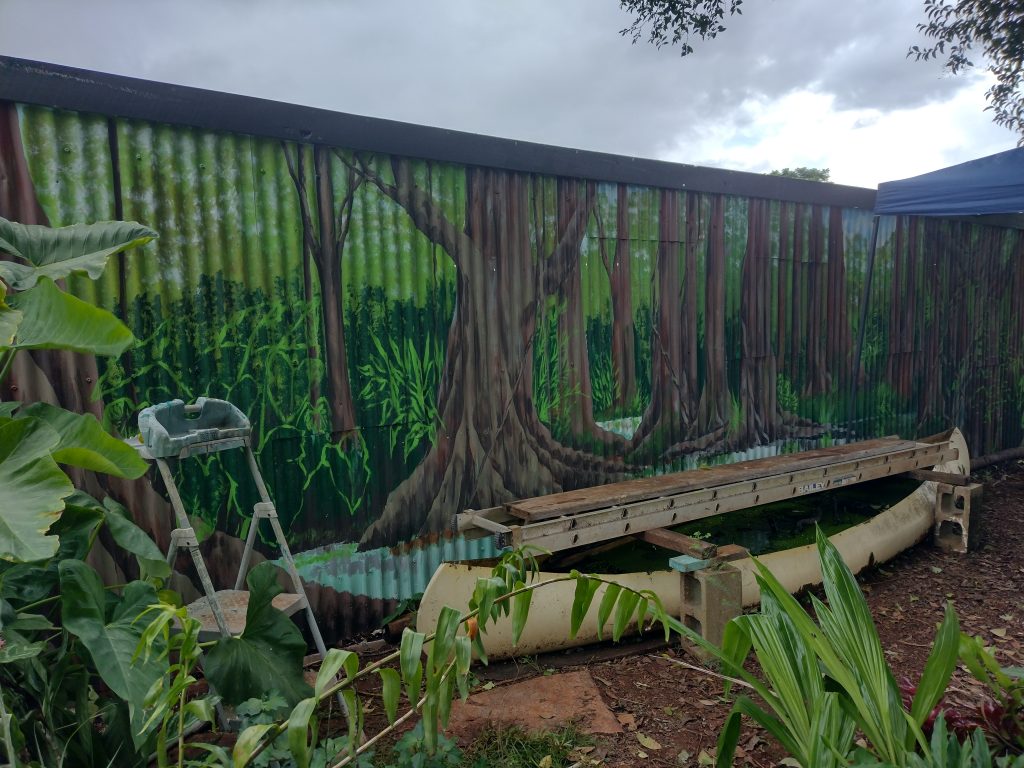
I had little idea of what I was doing until I placed the first mark. I’d made a rough sketch, but the scale was all wrong so there was little to be gained from looking at it. Here I was trying to figure out where to place the creek, which Pete was keen to include. An old canoe, come to rest at the foot of the fence, was filled with water; lotus, green weed and tadpoles had now taken up residence. Not only was it immoveable and extremely awkward to paint around, but the idea was for it to become a part of the picture, as if it had come to rest on the shores of a waterway. We both liked the mystery. Where had the inhabitants gone? It was obviously long abandoned; had the paddlers perished, or simply obeyed a call to disappear into the trees, never to return? Perhaps the boat had sprung a leak, and they had simply walked home. I favour the idea they’re living free, unseen. My problem remained, though, of how to paint it.
I wanted a little light in the sky. Although we wouldn’t be seeing the tops of the trees, there would be little glimmers of sky through the canopy here and there. If I placed it above the creek, I’d be able to use some pale colours in the water, which I was already concerned about portraying convincingly.
The limitations of the surface were immediately obvious: it was impossible to use horizontal brush-strokes, which one would normally do for calm water. Making the distinction between water and vegetation without variation in strokes was going to be tricky.
I started placing random upright tree trunks, trying to get a feel for how it was all going to work in terms of composition, scale and tone. The configuration lent itself to trees and I was glad we had decided on this, and not my alternative suggestion of a lake scene instead.
If you look carefully you can see that it has rained overnight and there’s a small lake on the roof of the gazebo!
Stage 2
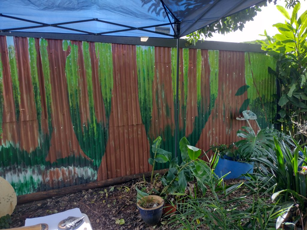
Studying an existing tree, although not of the same type, I tried to figure out which colours I would use on the trunks. First, I placed more of them in their final position, using a plain, unmixed brown. I then brushed a little blue into the sky where I thought it might be, before pouring a mix of six or seven different greens into a roller tray and, utilising a piece of bathroom sponge, attempted to represent the leafy understory. This should have been simple enough after all my sponging practice at the pottery but again, the dreaded corrugation, along with the paint drying out quickly despite the humidity, added to my frustration.
Stage 3
It was all looking rather flat, so I tried to add some lighter tones to the trees, and to grey it up a bit as it was rather too brown. Things began to show more promise once some form started to emerge, but the colour still wasn’t right.
I also needed more sky showing through as the background was just too solid.
I was lucky in that the weather was holding. During the very brief showers I ran inside for a much-needed coffee, and to contemplate how much paint I was getting onto myself and my clothes.
Stage 4
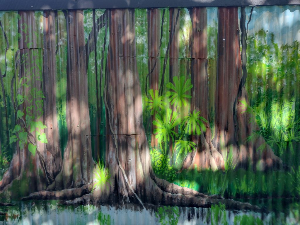
I mixed a different pale brown to cover most of the grey, although I left little bits poking through here and there to denote rough patches on the bark. I also left tiny areas of the original turquoise background colour showing under some dry brush strokes, suggesting lichen. These were, accidentally, some of my favourite parts.
Happier with the tree colour I began to add some creepers and to pick out more detail.
Stage 5
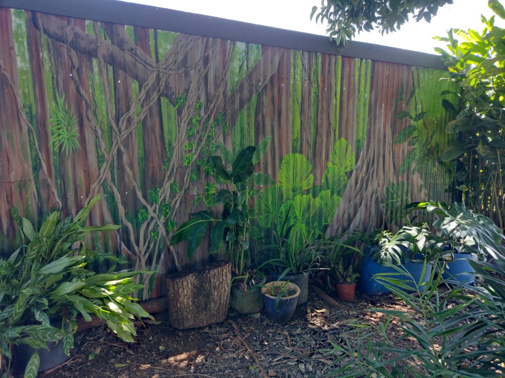
Using existing potted plants which had been sitting up against the fence and moved out of my way, I began to outline some leaves in the areas where the plants would eventually live. The idea was that the painted leaves would form a ‘background’ to the real ones, a kind of shadow, creating a 3D effect.
I had to paint a lot of other types without their living counterparts as well, for which I used photographs I’d taken specifically for the project, in forests I’d walked through on my journey. I tried to stick to ones I’d actually seen in the Tablelands area, though, for authenticity. The printing of the photographs to work from did not come out very successfully so a lot of guesswork was involved when it came to painting them.
Stage 6
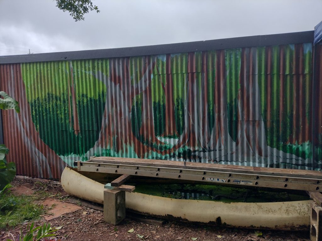
I soon learned that the mural was bathed in sunlight early each morning, and that if I made sure I painted the light falling on the trees from the correct direction, it really looked like sun on trees, rather than sun on a painted fence. I’d initially put the shadows on the wrong side – sod’s law – but it was improved no end once I’d corrected it.
I’m still wondering what to do with the water, which is beginning to bug me as the rest of it takes shape.
I think it should be dark, to match what’s in the canoe.
Stage 7
Now I added highlights and lowlights by mixing a paint as dark as I could without using actual black, which flattens everything.
I began returning the plants to their rightful places, checking and finishing the leaves ‘behind’ them. I wasn’t very happy with the variegated vines on the trunks, but they were improved by adding a suggestion of shadow under each one.
There’s also the problem of tropical leaves being quite shiny. Adding white to the lightest areas didn’t work the way I’d hoped.
Stage 8
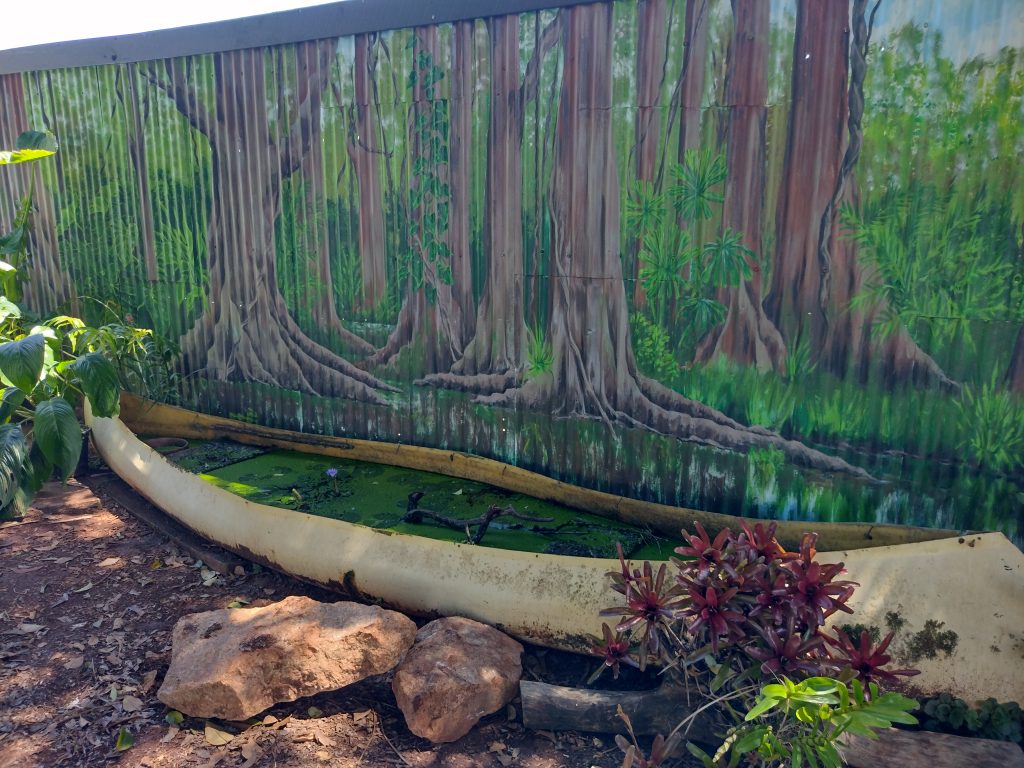
Having removed the cleverly designed ladder and wood contraption I had stood on to reach the top of the fence above the canoe, I could now reach low enough to paint the creek, squeezing my hand all the way down to the bottom. As I could only use up-and-down strokes, the easiest solution was to depict the water by the reflections in it, but without making it a mirror-image, because creeks are murky and dank. I left this part for the end, because I needed the ladder until the last minute but also, and mostly, because I was dreading making a hash of it. After tidying up the ‘shoreline’ and adding a bit of light on the tiny, glimpsed areas of water, I decided I’d got away with it. In fact, it’s what I was most proud of, in the end.
Phew! Now for that glass of wine I was promised…